Last March, being frustrated with a "spare tire" that I couldn't get rid of no matter how much I exercised, and inspired by the recommendation of a close friend, I decided to take a closer look at the Atkins diet. I bought the book, Dr. Atkin's New Diet Revolution, and after reading about the decades' worth of empirical evidence, I was convinced to give it a try.
Being the computer geek that I am, I have a body fat monitoring scale, and I monitored my 'fat' weight on a daily basis. I also kept careful record of all the food I ate, how many calories I consumed, and how many grams of carbs they contained.
My results during the induction phase were pretty much what you would expect from the Atkins diet. There was a sharp drop in weight during the first week, then a slow and steady decline during the following weeks. However, while I was on the induction phase I felt like my energy levels were not as high as they should be. It was probably due to the amount of exercise I do -- I barely got through half of my 1-hour workout before feeling pooped out -- and also because I didn't have that much fat to lose to begin with. So after a month on the induction phase, I started adding more carbs back in. I didn't abandon Atkins completely though; I tried to limit my carb intake to just before exercising.
Since that time I haven't lost weight as well as I did during the induction phase, but I had my energy back. I still kept track of both my weight and my food intake for the next few months. I had been keeping a chart of my weight, but just recently I decided to make another chart of my carb and calorie intake to compare with the weight chart to see what kind of correlation there was.
The results were rather amazing.
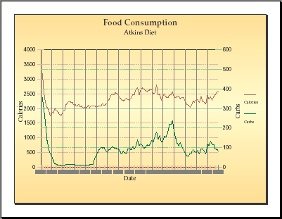
In the food consumption chart above, carbs are shown by the green line, and calories by the red line. Both lines have been smoothed by a weighted moving average over a 7 day period. It's obvious when I started the induction phase as well as when I ended. The lines have been scaled so that they are separate but still show their general shape. The horizontal axis is divided into weeks.
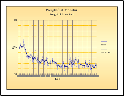
The fat weight chart shows the actual measured weight (in kg) of fat by the light blue line, which is smoothed by a custom moving average function in the dark blue line. You can see the sharp drop during the first week on the diet, followed by a gradual decrease for the next several weeks. Then it fluctuates up and down over the period that I stopped strictly following the Atkins diet.
What amazed me on looking at the graph is that there is a very strong correlation between the level of carb intake and the gains or losses in fat weight. On the other hand, the calorie intake often follows the path of the carb intake, which makes it hard to tell whether calories are really what determines the amount of fat stored, as I keep hearing over and over. After all, the initial drop in my fat weight also corresponded to my lowest recorded caloric intake. It's conceivable that eating foods higher in carbohydrates increases your appetite, resulting in eating more calories, which then makes you gain weight. So I took out a pen and ruler and made a careful week-by-week comparison of the two charts.
It's difficult to separate the correlation between carb intake and carolic intake, but in fact there are a few places on the chart where they diverge. First, notice the bulge during the week between 11-Apr and 18-Apr. On the carb line, it kind of resembles part of the Grand Teton mountains. On the calorie line, instead of having a sharp peak, there is a dip in the middle. Now compare this to the fat chart: just three days behind in that week, there is a bump that looks exactly like the carb line!
Next, look near the end of April. The carb line shows a spike on 30-Apr, whereas the calorie line shows a dip on 1-Mar. The fat chart, in this general area, shows a spike instead of a dip.
Finally, the biggest clear evidence lies in the two weeks from 9-May to 23-May. Over this period, the carb line shows a small spike followed by a larger spike. The calorie line, on the other hand, shows a medium spike followed by a small spike. Now look at the same time period on the fat char: there is a small bump followed by a larger bump, just like the carb line!
I believe the evidence clearly shows not only that fat gain or loss is strongly affected by the amount of carbohydrates consumed, but also that the amount of calories consumed has very little to do with changes in fat.
Another interesting relation I found is that the trends of the fat weight chart are phase-shifted from those in the carb intake chart by a period of roughly 2-5 days. There is a little stretching and shrinking, but it clearly shows that there is a considerable time lag in fat deposit and removal. In other words, if you weigh in one morning and find that you suddenly weigh more than you expected, don't blame the meal you ate the night before. The food you eat won't come back to haunt you until half a week later! (This discovery may be a confirmation of Dr. Atkin's statement that your body stores enough carbohydrate reserve to fuel it for approximately 48 hours.)
Another little item worth noting. From the charts, it appears that my personal Critical Carbohydrate Level (CCL) is somewhere above 100g. (It probably varies depending on how much exercise I get -- I usually have an intense work out at least 5 times per week, for about an hour per session.) In examining contiguous periods of 1-3 weeks, I have found that whenever my average daily carb intake was below 75g, I lost weight. When it rose above 150g, I gained weight. I can't tell whether there is any correlation between the rate of change and carb intake -- perhaps I'll make another chart for that.